AI art is useful for exploring visual directions and generating palette ideas quickly, but it should not be the only approval process for brand color decisions.

A data-informed color system adds contrast checks, audience context, defined color roles, and documentation that make visuals more consistent across campaigns and products.
For a solo creator, a simple AI tool and palette workflow may be enough. For teams managing shared assets, a color management platform or creative software subscription can reduce handoff problems.
When color choices affect a long-term identity, packaging, or positioning, professional design support can be worth comparing. The best option depends on how much control, collaboration, and commercial-use review your project requires.
At a Glance
- Use AI art for exploration: It can generate fast visual directions, but results may vary between prompts and sessions.
- Use data for selection: Customer research, campaign performance, product analytics, and accessibility checks can inform final color decisions.
- Build a system, not just a palette: Define roles for primary, secondary, background, text, accent, and status colors.
| Option | Cost Model | Control and Collaboration | Best Use Case |
|---|---|---|---|
| AI image tool | Often available through usage limits, credits, or subscription plans | Fast prompt-based exploration; output can vary | Early concepts, campaign mood boards, and visual inspiration |
| Color workflow or brand color platform | May be offered as creative software or team subscription access | Better for shared palettes, export formats, documentation, and handoff | Teams that need repeatable color decisions across channels |
| Professional brand design service | Project quote or retained support | Human review, research context, stakeholder alignment, and tailored guidance | Brand refreshes, packaging, positioning, or long-term identity work |
What AI-Generated Art Can—and Cannot—Do for Color Decisions
The Quick Answer: Use AI for Exploration, Not as the Only Approval Process
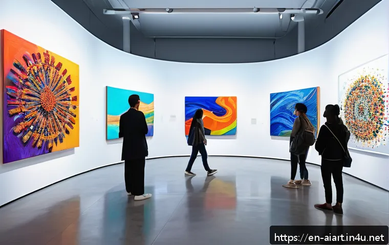
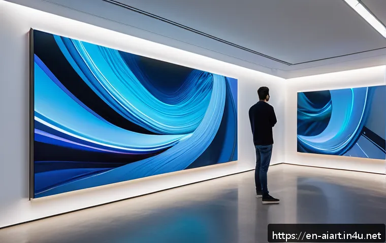
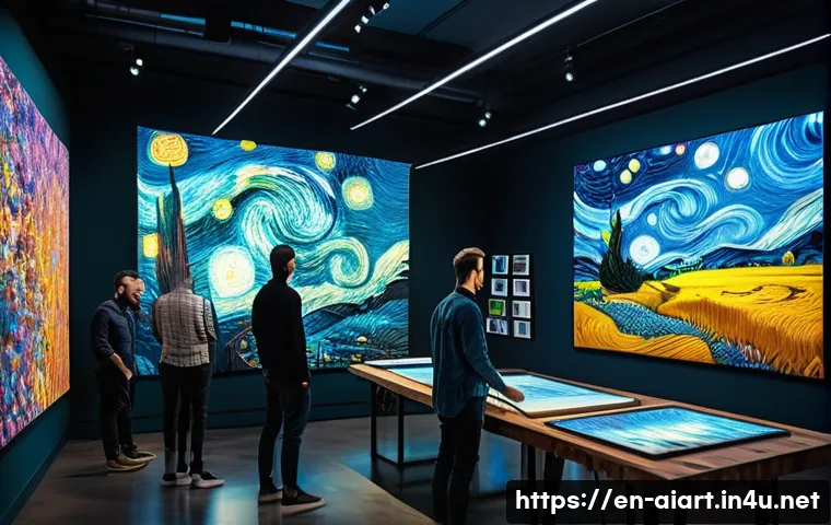
AI-generated art can quickly produce visual references that would take longer to assemble manually. It is useful when you need to compare moods, lighting styles, color relationships, or broad creative directions. However, an attractive generated image is not proof that a palette fits your audience, supports readability, or works consistently in a real layout.
Use AI output as a starting point. Treat it as a collection of candidate ideas rather than a finished brand color system. A single image may contain many subtle shades that look good together in context but become confusing when used across ads, landing pages, interfaces, and social graphics.
Where Data Improves Palette Choices for Real Campaigns and Products
Data helps move the process from personal taste to informed judgment. Customer research can reveal audience expectations. Campaign performance can show how visual approaches perform in a specific channel. Product analytics can identify where users interact with calls to action, while accessibility checks help identify contrast issues between text and colored backgrounds.
Color perception is affected by surrounding colors, display settings, lighting, and cultural associations. That means one palette should not be assumed to communicate the same thing in every market or context. Data can inform the decision, but human review is still needed to interpret what the data means for a particular audience.
The Three Checks Before Using a Generated Image or Palette
First, check whether the image supports the intended action: reading, clicking, exploring, or recognizing the brand. Second, review contrast when text sits over a colored background or image. Third, confirm that the visual direction can be converted into named, reusable colors rather than depending on one generated composition.
A practical review includes hue, saturation, lightness, contrast ratio, and color distribution across the layout. If a color only works in a complex image but fails as a button, text color, or background, it may be inspiration rather than a production-ready asset.
Compare AI Art Tools, Color Platforms, and Professional Design Services
Cost, Licensing, Workflow Control, and Collaboration Differences
Commercial AI design tools can differ in image rights, privacy controls, export formats, collaboration features, and usage limits. These details matter when work is created for a client, shared within a team, or used in a public campaign. Review current terms directly before selecting a platform for commercial work.
A color management workflow focuses on a different problem. Instead of only generating images, it helps teams preserve approved values, assign color roles, and share assets across design and marketing work. A specialist service adds another layer: human judgment around research, positioning, stakeholder feedback, and practical usage rules.
When a Monthly Creative Software Plan Is Enough
A creative software subscription can be a sensible choice when your team already has a clear visual direction and mainly needs a repeatable workflow. This is especially relevant when several people create presentations, ads, social media assets, or product screens from the same approved palette.
Look for export options, shared libraries, collaboration controls, privacy settings, and documented color values. These capabilities can matter more than the number of AI styles available. Check the official plan details for current usage limits, commercial terms, and team features before committing.
When a Brand Designer or Agency Quote Is More Cost-Effective
External design support may be more appropriate when the project affects brand positioning, packaging, a product interface, or a long-term identity. In these cases, correcting an unclear color system later can create repeated work across many touchpoints.
A design quote is not automatically the right choice for every project. It becomes easier to justify when you need research-informed recommendations, stakeholder alignment, documented usage rules, or a system that must work beyond a single campaign. Ask where the service covers discovery, accessibility review, handoff materials, and revision scope.
Build a Data-Informed Color System from an AI Visual Direction
Start with a Visual Brief, Audience Context, and Intended Action
Before writing prompts, define what the visual needs to accomplish. Is the goal to make a product feel calm, energetic, premium, practical, or easy to navigate? What action should a visitor take after seeing the design? A short brief keeps AI exploration connected to a real business need rather than random aesthetic variation.
Include the audience context, intended channel, existing brand assets, and any readability requirements. This gives your creative software workflow a clear filter for choosing between generated concepts.
Extract Candidate Colors Without Copying Every Generated Shade
Generated images often contain gradients, shadows, reflections, and many near-identical colors. Avoid turning every visible shade into a brand color. Instead, select a small set of candidate colors that represent the core visual direction, then evaluate each one in real layouts.
Document the candidates by measurable attributes such as hue, saturation, and lightness. This makes it easier to compare alternatives and adjust a palette without losing the original intent.
Assign Functional Roles: Backgrounds, Text, Accents, and Alerts
A usable brand system assigns colors to jobs. Define a primary color for recognition, secondary colors for support, background colors for space, text colors for readability, accents for emphasis, and status colors for messages or alerts. A color can be appealing but still be unsuitable for every role.
This role-based approach prevents a common problem: using the same bright color for headlines, buttons, warnings, and decorative elements. Clear roles create stronger hierarchy and make team handoff easier.
Test Contrast, Consistency, and Use Across Digital Touchpoints
Test the palette in the places where it will actually appear: web sections, email graphics, ads, presentations, product screens, and image overlays. Contrast is a key accessibility consideration whenever text appears over color or photography.
Do not rely only on a palette preview. A color combination that looks balanced as small swatches can become difficult to read when used for a headline, navigation element, or call to action. Keep records of approved combinations so future assets remain consistent.
Common Mistakes in AI-Assisted Color Design

Treating Attractive Output as Evidence of Audience Fit
AI can create polished-looking work quickly, but visual appeal alone does not establish audience relevance or campaign effectiveness. A palette should be reviewed against the brief, the audience context, and available performance or research data. Avoid claiming that a particular AI-generated palette will improve conversion for every campaign.
Using Too Many Accent Colors or Low-Contrast Combinations
Too many accents can weaken hierarchy and make a layout feel inconsistent. Low-contrast combinations can also make key content harder to read. Keep accent colors purposeful, and verify text-background combinations before publishing.
Ignoring Commercial-Use Terms, Privacy Settings, and Brand Governance
Do not assume that every AI platform has the same commercial-use rights, training-data practices, privacy controls, or collaboration policies. These terms can change, and the right choice depends on the provider and project. Review the current official documentation, particularly when using client materials or sensitive internal assets.
Failing to Document Final Color Values and Usage Rules
A palette becomes difficult to manage when the only reference is an AI-generated image or a forgotten prompt. Record final values, functional roles, contrast-approved combinations, and examples of intended use. This turns a one-time creative experiment into a reusable brand design resource.
Choose the Right Workflow for Your Team and Project
Solo Creators: Fast Content Production with a Simple Palette Kit
Solo creators can use AI art to develop a visual direction, then create a compact palette kit with clearly labeled background, text, and accent choices. The priority is speed without losing basic consistency. A lightweight creative software plan may be useful if it helps you save assets and reuse the same color rules.
Marketing Teams: Campaign Testing and Reusable Brand Templates
Marketing teams often need multiple assets across channels and contributors. A shared color workflow is useful when campaign concepts must remain connected to the parent brand. Use data from customer research and campaign performance as inputs, while keeping final decisions documented in reusable templates or shared libraries.
Product Teams: Accessibility, UI States, and Design-System Alignment
Product teams need more than a visually interesting palette. They need colors that work for text, backgrounds, interactive elements, and status communication. Color roles should align with the wider design system, and contrast should be checked wherever users need to read or take action.
Brand Refreshes: When Research, Stakeholder Review, and External Expertise Matter
A brand refresh can affect many materials at once, from digital touchpoints to packaging and sales documents. AI can speed up visual exploration, but professional design support may help when the project requires broader research, stakeholder review, and long-term governance. The value is not just a new palette; it is a system people can apply correctly.
Selection Criteria and Comparison Summary
Choose an AI tool when speed, prompt-based exploration, and early visual direction are the priority. Choose a color workflow platform when your main need is consistency, shared assets, export control, and team handoff. Request a design quote when the work affects positioning, packaging, product experience, or a long-term identity.
Before paying for software, credits, or design services, check: commercial-use terms; privacy controls; collaboration needs; export formats; accessibility workflow; and whether the final palette will be documented by role. For subscription features, usage limits, and service scope, review the official plan or quote details on the relevant provider page.
Closing Thoughts
AI art can make the first stage of color exploration much faster. The final decision should still account for readability, context, team workflow, and the role each color will play. A strong process separates inspiration from approval. That separation helps teams create visuals that are expressive without becoming inconsistent.
Useful Information to Keep in Mind
Color context matters: surrounding colors, screens, lighting, and cultural associations can change perception.
Data is an input, not an automatic answer: research, analytics, and campaign results require human interpretation.
Documentation protects consistency: named roles and approved combinations are more useful than an image alone.
Important Considerations
No AI-generated palette can be assumed to improve results for a specific audience or campaign. Commercial rights, training-data practices, privacy settings, subscription pricing, credit limits, and usage rules vary by provider and can change over time. Verify current terms and test color use in the real contexts where your audience will see it.
Frequently Asked Questions
Q1. Can AI art create a usable brand color palette?
A1. AI art can generate useful palette ideas and visual directions quickly. To make the result usable for a brand, define functional color roles, check contrast, evaluate the palette in real layouts, and document the final values and rules.
Q2. Do I need a paid color design tool if I already use an AI image generator?
A2. Not always. An AI image generator may be enough for early exploration or simple individual projects. A paid color workflow or creative software tool becomes more useful when you need shared assets, export formats, collaboration controls, reusable templates, or stronger brand consistency.
Q3. When is it worth hiring a designer for AI-assisted branding work?
A3. Consider professional support when color decisions affect a long-term identity, packaging, positioning, product experience, or multiple stakeholder groups. A designer can help translate AI-generated inspiration into a documented system that is practical across real brand touchpoints.